How to craft the ideal structure for your online store's homepage
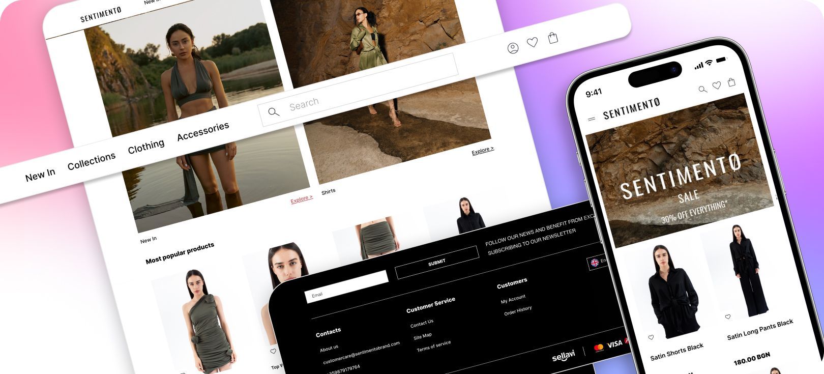
The main page of your store serves as the digital face of your brand. In the brief span of 5 to 8 seconds, an average visitor decides whether the e-commerce website piques their interest or not. Consequently, the homepage must be of such high quality that it instantly compels individuals to delve further and explore the store.
An exemplary homepage is both informative and transparent, showcasing available products and the benefits awaiting buyers, all while evoking trust. In this article, we'll guide you on achieving precisely that.
How do you structure an e-commerce homepage?
The composition of an online store's main page comprises the following elements:
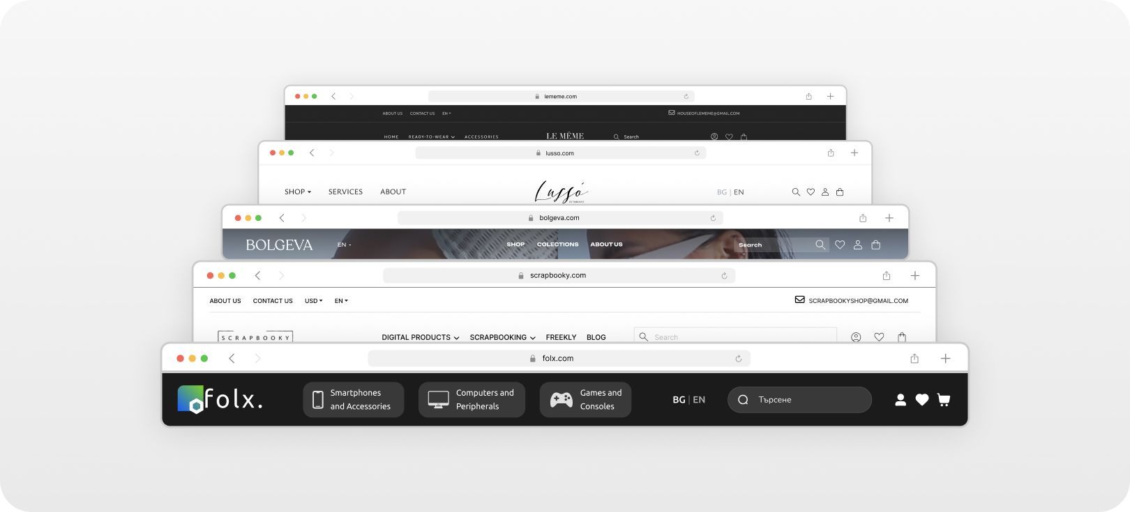
Header
This is the first aspect a potential online shopper encounters. Here, you should feature:
- Logo and tagline — signature conveying brand information;
- Search bar or an active search icon;
- Contact information;
- A button to access the customer's account;
- A shopping cart.
If the header's size permits, consider incorporating links to sections such as "About Us," "Shipping," and "Payment." This information proves highly beneficial to buyers.
Menu
This section facilitates navigation throughout the online store. There are two primary menu types: horizontal and vertical.
The horizontal menu typically resides just below the header and should include links to the store's primary sections and product categories. Including a button-styled link to special offers is a significant advantage.
To enhance user-friendliness, you can arrange section links in a drop-down or second-level menu format.
The vertical menu, located on the left side of the screen, complements the horizontal one. It displays subcategories and subsections, enabling swift online shop navigation and one-click access to various sections.
On mobile devices, it's advisable to use only the vertical menu, as it harmonizes better with smartphone screens and offers more convenient finger control.

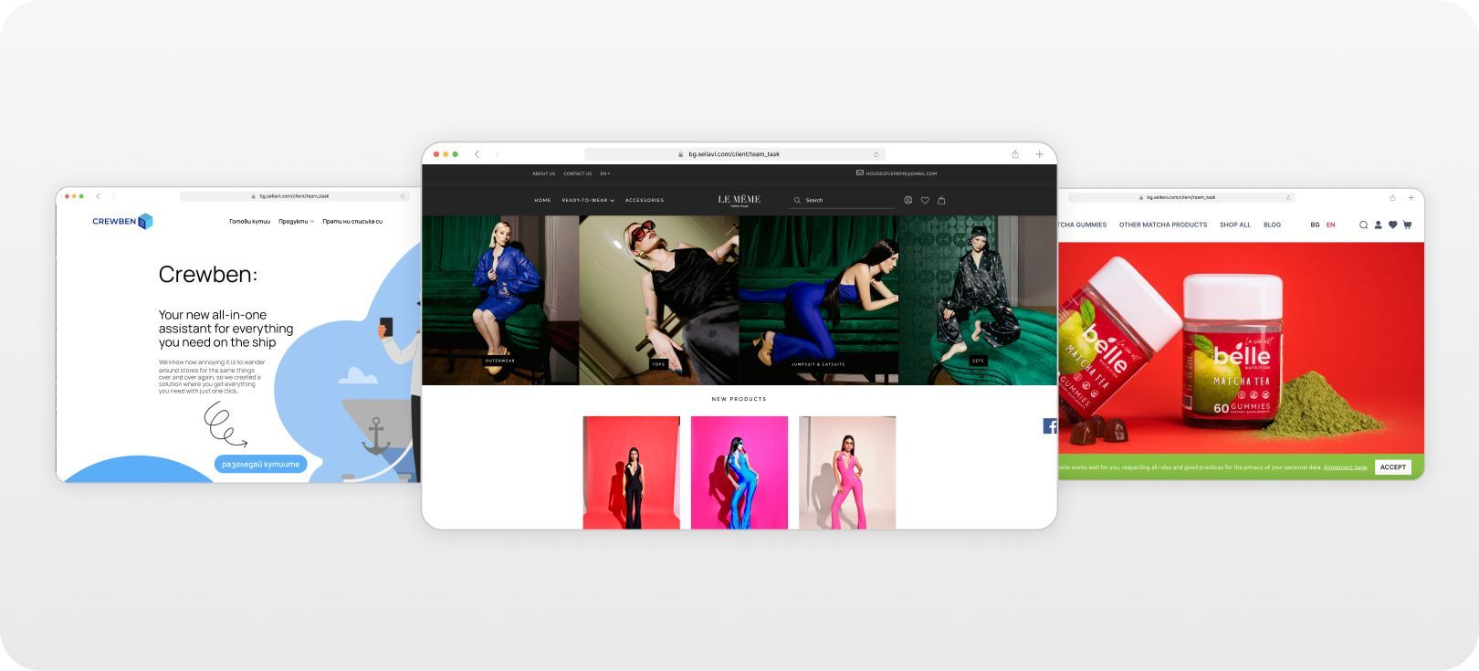
Visual block
Over the past decade, the significance of visual content in the realm of e-commerce business has grown significantly. After all, they say people love with their eyes, making it imperative for a homepage to boast high-quality, memorable visuals.
The visual block comprises several components, with banners taking center stage. These banners should convey essential information regarding discounts, promotions, new arrivals, and noteworthy events, such as a brand's anniversary.
When multiple ads are involved, the banner block is best presented as a slider. The optimal transition speed between slides typically falls in the range of 5 to 8 seconds, contingent upon the volume of information. It's advisable to complement the carousel with manual scrolling buttons, allowing visitors to explore it at their own pace.
In addition to banners, the online store's visual block should showcase select products from the online store. However, overwhelming visitors with an exhaustive catalog isn't recommended. Instead, feature a curated selection of products likely to pique buyers' interest, such as:
- Bestsellers;
- New arrivals;
- Discounted products;
- Unique offerings.
For each category, it's generally sufficient to display between five to ten products. Going overboard might negatively impact a buyer's perception.
If the brand maintains an active presence on social media, consider including beautifully designed blog posts following the product showcase. This presents an additional opportunity to capture the customers' attention.
Trust-building block
The primary objective of this block is to dispel potential customer objections and foster trust in the store. Achieve this through various means:
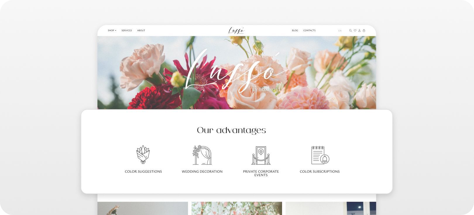
- Showcasing certificates, awards, and licenses.
- Featuring customer reviews with open comment sections.
- Including publications about the company from reputable third-party sources.
Another approach involves creating a text block where the online store's advantages are elaborated in detail. Embedding SEO keywords can help identify and promote the e-commerce store to search engine robots.
If there's space available on the main page, consider adding a small block encouraging visitors to subscribe to the newsletter.
Footer
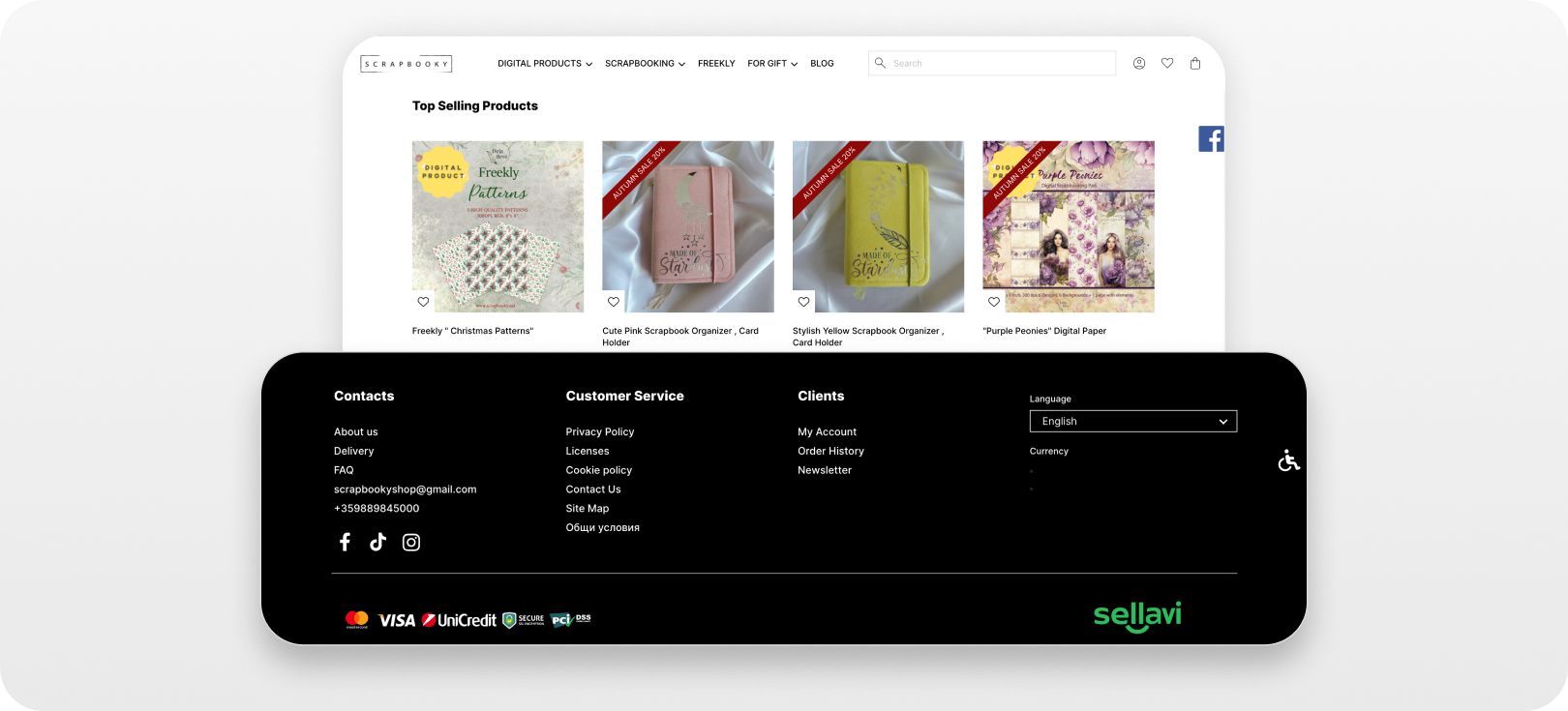
The footer serves as the final repository of vital information, addressing any remaining doubts and providing data not found in the header or main body of the main page. Here, you'll find:
- The physical address of the online store;
- Addresses and operating hours of offline points;
- Comprehensive contact details and links to messaging apps;
- A feedback form;
- Support service hours;
- A site map;
- Expanded information about various sections, highlighting the most pertinent subsections for buyers;
- Ordering and delivery methods;
- Comprehensive details on available payment methods;
- Warranty and return conditions;
- Privacy Policy;
- Terms of use;
- Links to social media platforms;
- The site's logo;
- Copyright information.
Additionally, you may provide a link to a page containing information about potential collaborations. This extensive list can be tailored to align with the online store's specific area of operation. Such information holds immense value for buyers, substantially elevating their trust in the platform.
Crucial pointers to create the ideal homepage
While the structural elements hold immense importance, a few additional considerations are pivotal in the quest to create the perfect homepage.
Design
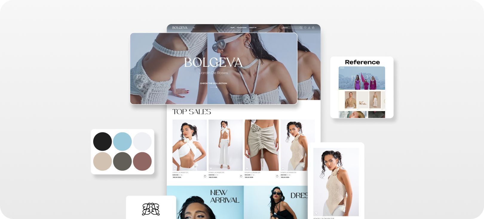
The homepage is an integral part of the online store's overall aesthetic. As such, factors like font choices, graphic elements, and the general stylistic approach should cohesively blend together.
Optimization
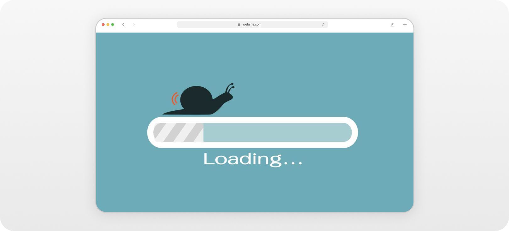
While it's vital to employ high-quality images and visual elements, it's equally imperative to keep a keen eye on their file sizes. Ensuring swift website loading times is paramount, for even the most ingenious homepage will falter if bogged down by sluggish loading speeds.
Mobile optimization
Just as with the remaining pages of the site, the homepage must seamlessly translate into a mobile-friendly version. It's preferable to maintain a streamlined structure than to compromise functionality when adapting for mobile.
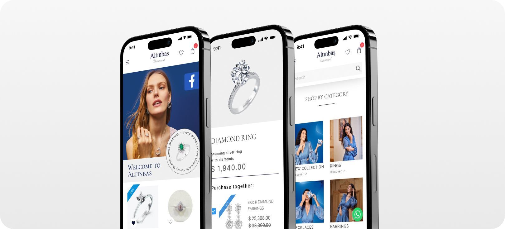
With these pointers in mind, we conclude our tips. It's worth mentioning that the Sellavi website-building platform offers a comprehensive array of templates and tools, designed to facilitate the creation of a high-quality, truly effective homepage. Embark on your online store journey with Sellavi and commence selling as early as tomorrow!